_tests:
2. Second Test - 4/29/2008
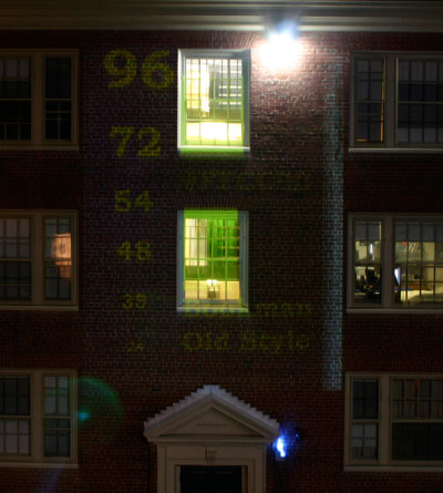
:: Like with Analog Cinematic Projection, I have developed a "test" pattern to orient the space, the color settings and the projector's positioning. Note the font sizes in decreasing order and the diminishing legibility. 48 is reall the minimum in terms of legibility.
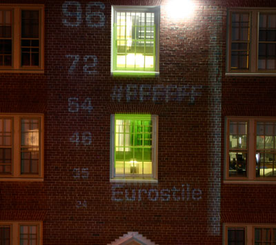
:: Another Test Pattern: Featuring Eurostile in white offset. This color is more crisp and visible, but also cliched and somewhat insipid. I prefer the yellow-orange.
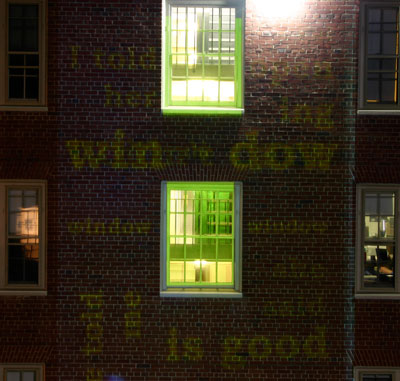
:: The first true facadeal poem. Designed specifically for the space. The photo isn't great because of the long exposure I needed to capture the words, which move quickly, and the obnoxious light in the upper right of the top window.
NOTES
-
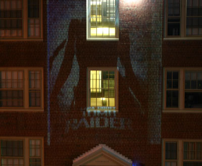
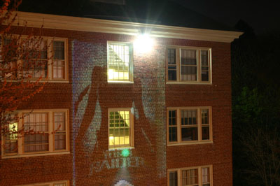
Resolution of the Projector was an important component of the artwork that I had not considered/planned for.
-
Ultimately I found that the projector required a display resolution of 1024 x 768 (stretched) in a non-mirrored display setting to look as I had planned for it to.
-
The gray background color was perfect: blurred wonderfuly with the brick.
-
Font tests revealed that fonts need to be sized at about 48 to be fully legible.
-
Ambient light (in the upper right of window) really destroys the upper right of projection field and makes it useless. I have had to correct some of my projects to ignore this region.
-
I am also considering "modifying" that light for the show.
-
Passerbys were very interested and engaged in the work. Read it out loud and asked me about it.
-
Also complemented animated sequences.
-
Window regions are lit solid yellow so that I can align projection correctly: this lighting further engaged people inside the building to come out.
-
Some cropping occured: need to address smaller space, about a foot less at top and bottom to work with.
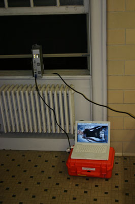
Borrowed Sony VPL CP1 Projector with throw of 600 Lumens for projection on to the facade of the dormitory across from my room. Gap is about 45 feet. I projected a promotional image for the Tomb Raider movement, with good color and good contrast.